SO CERAMIC
SO CERAMIC
SO CERAMIC
SO CERAMIC
A handcrafted identity for SO CERAMIC — bringing a physical, offline art form into a clear, consistent brand world, without losing its raw, tactile character.
A handcrafted identity for SO CERAMIC — bringing a physical, offline art form into a clear, consistent brand world, without losing its raw, tactile character.
A handcrafted identity for SO CERAMIC — bringing a physical, offline art form into a clear, consistent brand world, without losing its raw, tactile character.
A handcrafted identity for SO CERAMIC — bringing a physical, offline art form into a clear, consistent brand world, without losing its raw, tactile character.
Client
Client
Client
Client
studio offline ceramic
Industry
Industry
Industry
Industry
Ceramic
Service
Service
Service
Service
Brand Identity
Print & Packaging Design
Merch Implementation
Duration
Duration
Duration
Duration
continued cooperation
OverView
OverView
OverView
OverView
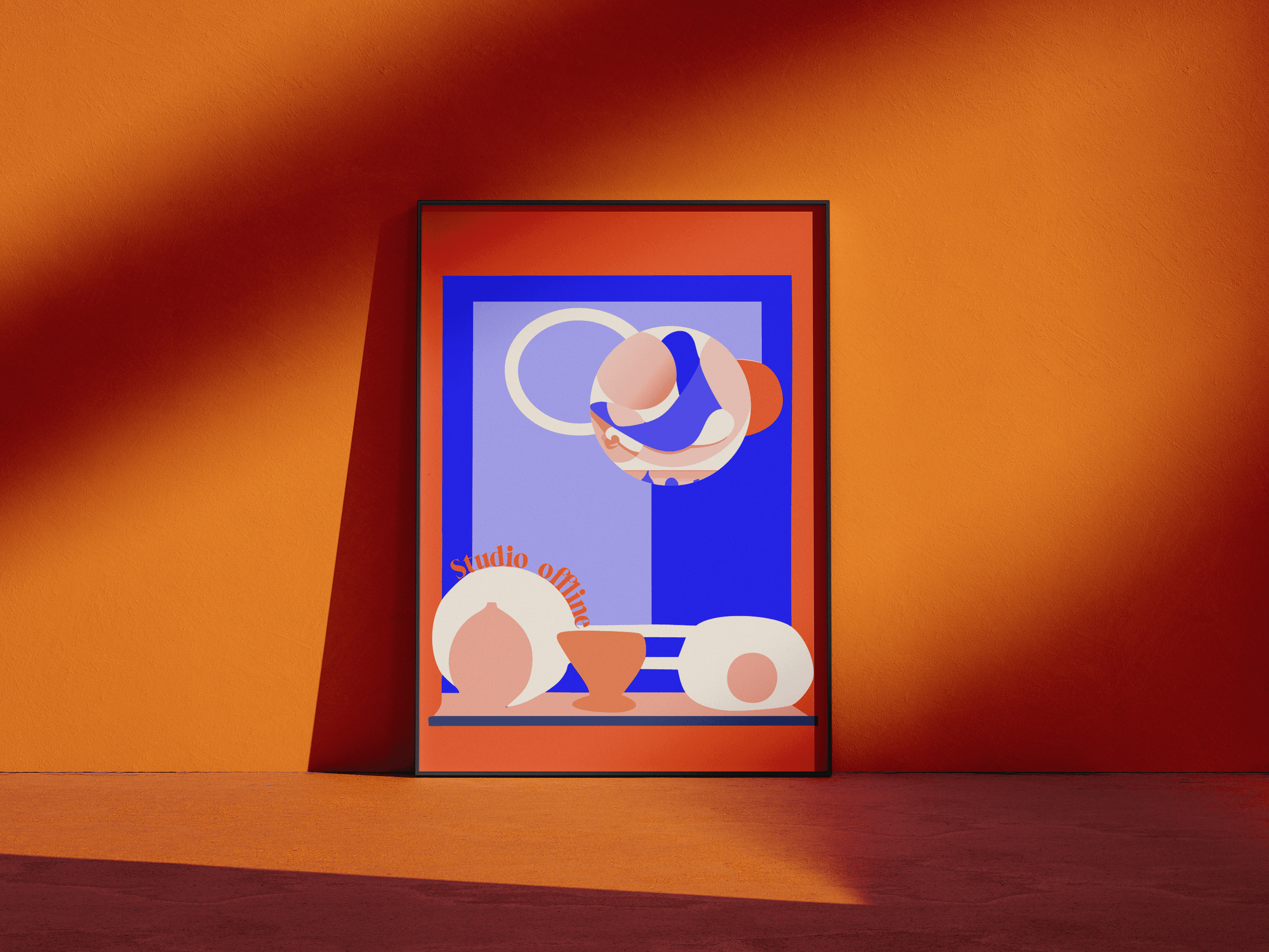
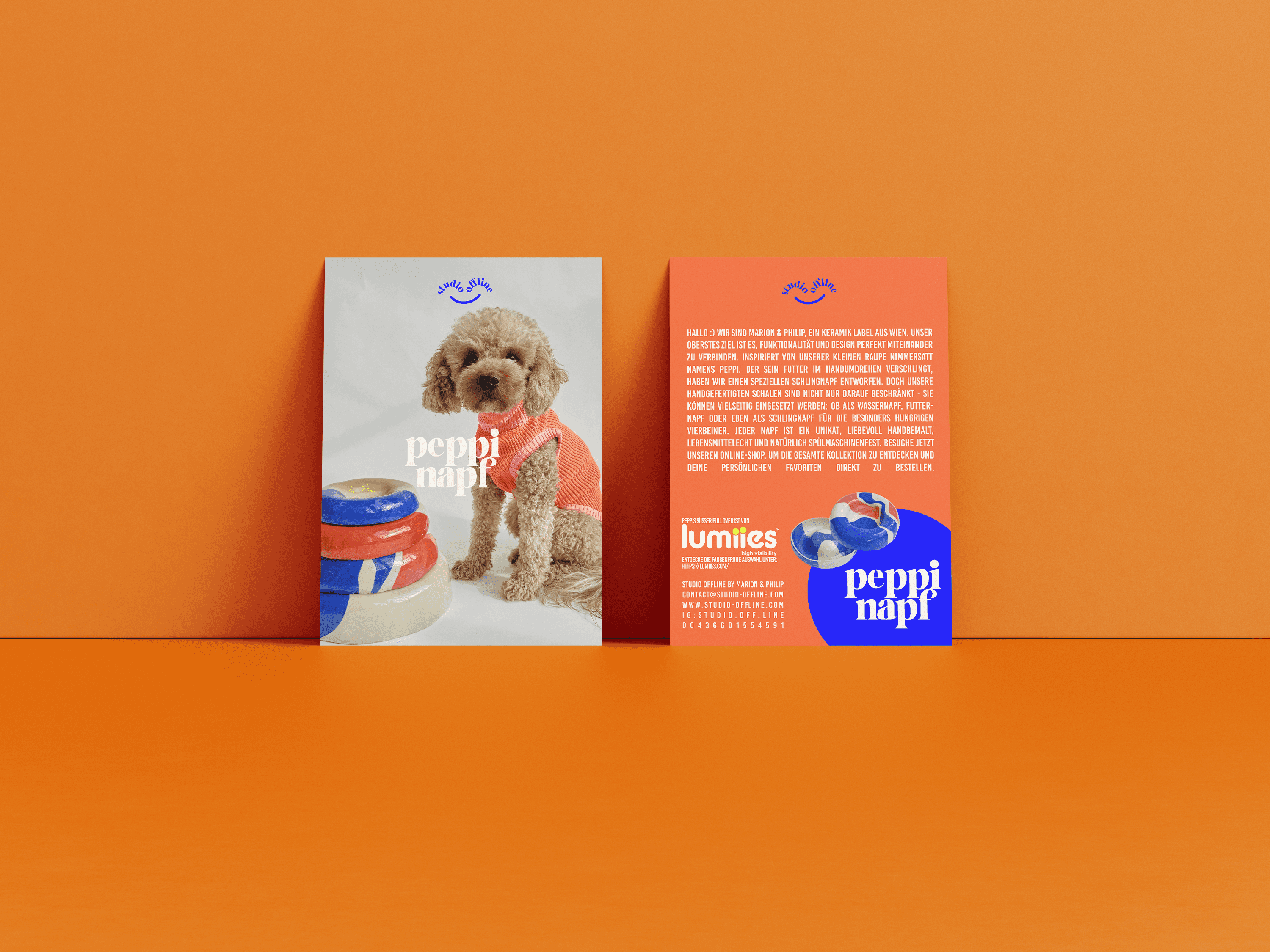
SO CERAMIC is a Vienna-based ceramics label known for its unique, handcrafted pieces rooted in physical process and material honesty. Together, we developed a full brand identity that captures the calm, thoughtful energy of the studio — without over-polishing it. The project included a brand workshop, voice development, logodesign, a defined color system and typography, as well as a detailed brand handbook. Visual consistency was carried across physical materials such as business cards, posters, shipping packaging and merch — including custom-embroidered aprons and caps. We also supported the sourcing and production of all printed items and textiles.
SO CERAMIC is a Vienna-based ceramics label known for its unique, handcrafted pieces rooted in physical process and material honesty. Together, we developed a full brand identity that captures the calm, thoughtful energy of the studio — without over-polishing it. The project included a brand workshop, voice development, logodesign, a defined color system and typography, as well as a detailed brand handbook. Visual consistency was carried across physical materials such as business cards, posters, shipping packaging and merch — including custom-embroidered aprons and caps. We also supported the sourcing and production of all printed items and textiles.
SO CERAMIC is a Vienna-based ceramics label known for its unique, handcrafted pieces rooted in physical process and material honesty. Together, we developed a full brand identity that captures the calm, thoughtful energy of the studio — without over-polishing it. The project included a brand workshop, voice development, logodesign, a defined color system and typography, as well as a detailed brand handbook. Visual consistency was carried across physical materials such as business cards, posters, shipping packaging and merch — including custom-embroidered aprons and caps. We also supported the sourcing and production of all printed items and textiles.
SO CERAMIC is a Vienna-based ceramics label known for its unique, handcrafted pieces rooted in physical process and material honesty. Together, we developed a full brand identity that captures the calm, thoughtful energy of the studio — without over-polishing it. The project included a brand workshop, voice development, logodesign, a defined color system and typography, as well as a detailed brand handbook. Visual consistency was carried across physical materials such as business cards, posters, shipping packaging and merch — including custom-embroidered aprons and caps. We also supported the sourcing and production of all printed items and textiles.

The Challenge
The Challenge
The Challenge
The Challenge
Ceramics is a deeply physical craft — slow, personal, and tactile. The challenge was to create a brand that could exist online, but still feel analog, rooted, and honest. The visual language needed to reflect the handmade process without falling into clichés — and be flexible enough to work across product packaging, print, and digital.
Ceramics is a deeply physical craft — slow, personal, and tactile. The challenge was to create a brand that could exist online, but still feel analog, rooted, and honest. The visual language needed to reflect the handmade process without falling into clichés — and be flexible enough to work across product packaging, print, and digital.
Ceramics is a deeply physical craft — slow, personal, and tactile. The challenge was to create a brand that could exist online, but still feel analog, rooted, and honest. The visual language needed to reflect the handmade process without falling into clichés — and be flexible enough to work across product packaging, print, and digital.
Ceramics is a deeply physical craft — slow, personal, and tactile. The challenge was to create a brand that could exist online, but still feel analog, rooted, and honest. The visual language needed to reflect the handmade process without falling into clichés — and be flexible enough to work across product packaging, print, and digital.
The Solution
The Solution
The Solution
The Solution
We started with a collaborative brand workshop to explore values, tone, and positioning. From there, we developed a visual identity system including logo, color world, type system, and image style. Packaging design focused on sustainable simplicity — brown boxes with subtle branded stickers. For in-studio presence and merchandise, we designed embroidered aprons and caps that extend the brand through quiet utility. Printed assets like business cards, flyers and posters round out a system that supports both physical and digital touchpoints — always with a focus on grounding the brand in its “offline” roots.
We started with a collaborative brand workshop to explore values, tone, and positioning. From there, we developed a visual identity system including logo, color world, type system, and image style. Packaging design focused on sustainable simplicity — brown boxes with subtle branded stickers. For in-studio presence and merchandise, we designed embroidered aprons and caps that extend the brand through quiet utility. Printed assets like business cards, flyers and posters round out a system that supports both physical and digital touchpoints — always with a focus on grounding the brand in its “offline” roots.
We started with a collaborative brand workshop to explore values, tone, and positioning. From there, we developed a visual identity system including logo, color world, type system, and image style. Packaging design focused on sustainable simplicity — brown boxes with subtle branded stickers. For in-studio presence and merchandise, we designed embroidered aprons and caps that extend the brand through quiet utility. Printed assets like business cards, flyers and posters round out a system that supports both physical and digital touchpoints — always with a focus on grounding the brand in its “offline” roots.
We started with a collaborative brand workshop to explore values, tone, and positioning. From there, we developed a visual identity system including logo, color world, type system, and image style. Packaging design focused on sustainable simplicity — brown boxes with subtle branded stickers. For in-studio presence and merchandise, we designed embroidered aprons and caps that extend the brand through quiet utility. Printed assets like business cards, flyers and posters round out a system that supports both physical and digital touchpoints — always with a focus on grounding the brand in its “offline” roots.

The Result
The Result
The Result
The Result
SO CERAMIC now has a brand presence that reflects its materiality and calm strength — one that supports growth without losing its hands-on essence. Every touchpoint, from the shipping box to the apron worn at the wheel, speaks the same quiet, thoughtful language. The studio's identity is now both recognizable and restrained — allowing the ceramics themselves to remain the focus.
SO CERAMIC now has a brand presence that reflects its materiality and calm strength — one that supports growth without losing its hands-on essence. Every touchpoint, from the shipping box to the apron worn at the wheel, speaks the same quiet, thoughtful language. The studio's identity is now both recognizable and restrained — allowing the ceramics themselves to remain the focus.
SO CERAMIC now has a brand presence that reflects its materiality and calm strength — one that supports growth without losing its hands-on essence. Every touchpoint, from the shipping box to the apron worn at the wheel, speaks the same quiet, thoughtful language. The studio's identity is now both recognizable and restrained — allowing the ceramics themselves to remain the focus.
SO CERAMIC now has a brand presence that reflects its materiality and calm strength — one that supports growth without losing its hands-on essence. Every touchpoint, from the shipping box to the apron worn at the wheel, speaks the same quiet, thoughtful language. The studio's identity is now both recognizable and restrained — allowing the ceramics themselves to remain the focus.


